


When you hear about data visualisations, what comes to mind? Charts, graphs, all kinds of plots? Same here!!!
But what about design?
Did it ever occur to you that visualisations have to follow some design principles? Well, now you know... (even if you did, read on, you might learn one or two or even add to what i have here)
Okay, so, here are a few things to look out for during data visualization, especially for explanatory analysis.
1. *Chart junk - these are unnecessary elements in charts and graphs. For example, heavy grid lines, unnecessary text, pictures, shading or 3d, etc
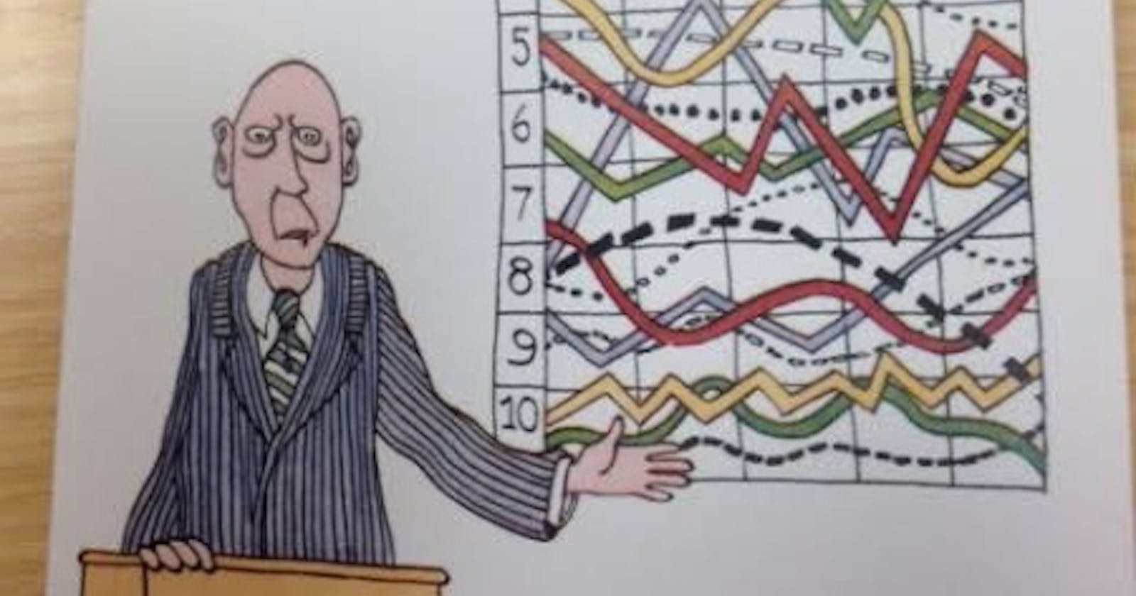
Look at the chart below.
Looking at this makes me laugh. From the pictures to the orientation. If this was an attempt at comedy, then it could pass. But it's not, it's supposed to convey insight which it doesn't even do a tiny bit of. That's because it's filled with a loooooot of junk and just like in nutrition, junk is unhealthy and should be completely left out of your visualisation.
Check out the clean chart below. No pictures, no shading, very simple and message passed!
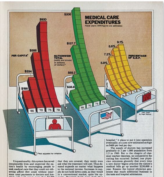
2. Data ink - Gridlines, Border lines, labels, markers, basically every feature on a visualisation makes use of ink to be displayed. But when large amount of ink is being used on everything else which doesn't actually describe the data, for example, too many markers, heavy border lines, it creates a low data ink ratio. This means that the amount of ink used to describe the data is smaller than the amount of ink used on other components of the visulization. Check the charts below for more clarification.
The first chart looks like something straight out of doomsday. You can see how it can be better shown with necessary text, no border or heavy grid lines. The high data ink ratio made it clearer and easier to interpret and still has all elements you need for a great visualisation. So, shun the temptation to add extra if it's not necessary. Simplicity is the goal!
3. Lie factor - This one is a bit tricky and can be violated without even knowing. Lie factor is the ratio between size of effect shown in graphic(∆visual/visualstart) to size of effect shown in data(∆data/datastart).
When it's greater than one, it means your visualization is over emphasizing the actual effect. When it's less than one, it means it's under emphasizing the actual effect. And when it's equal to one... You guessed right? It's perfect!
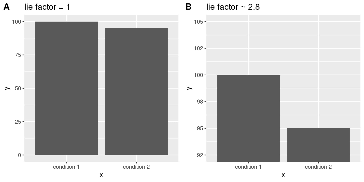
For the second bar chart, a simple change in scale gave the impression that the condition 2 was half of condition 1, whereas the difference was not much as seen from the first bar chart.
So next time, you want to scale your visualization, think about how it portrays the actual effect.
4. Colours
Yes! Analysts have to deal with colors too. And to think, I ran away from graphics because I found it difficult to use colors properly. Good thing is I don't have to use colors in analysis at all! Unless it's very necessary But hold on! That's my decision. I wouldn't want you to make the same decision without answering the following questions:
Do I need to use colours at all? Try to work with black and white first. If it conveys all necessary information, then that's all you need!
Do I necessarily need to use colour? If black and white doesn't get it right, then you can use less intense colours like natural colours or add grey value to bright colours to tone it down. Avoid rainbow colours, primary colours and other bright bold colours.
Is the colour adding any additional information? This is extremely important. If you want to highlight a particular data point in a graphic, or to identify groups of interest or show additional features, then You can use a complimentary colour. You can also use shapes for this same effect. However, colors and shapes are best used for categorical variables. For quantitative variables, variations in marker size would be a better choice.
Colors, shapes and markersize are great tools for visualization but not all washing requires antiseptic sometimes all you need is just detergent.
For explanatory purposes, do not use all (or any) of these tools unless it's absolutely necessary.